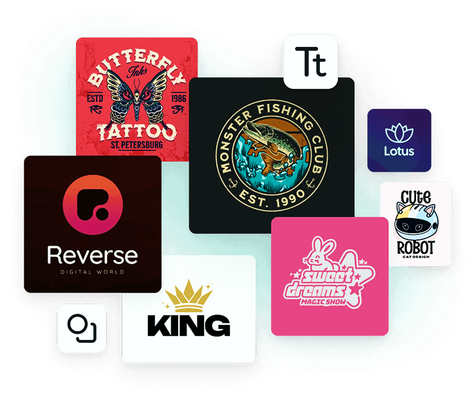
Logos are the face of a brand, representing its identity, values, and evolution. Over time, companies revamp their logos to stay relevant, appeal to modern audiences, and align with their changing brand narratives. Some logo redesigns create a lasting impact and inspire businesses across industries. In this article, we will delve into 12 famous companies that have successfully changed their logos along with insights on how a web development company can integrate branding and digital presence.
Apple
Apple has transformed from an intricate design in 1976 to a fully monochrome silhouette of its Apple trademark today. The transition from the rainbow Apple logo to the minimalistic, modern, innovative monochrome Apple silhouette shows how simple a redesign can yet solidify the identity of a product brand such as Apple as a pioneer in technology. The message herein is that simple itself would often create stronger brand recognition, a principle both in branding and web design.
Google’s original logo was colorful yet lacked the sophistication of modern branding. In 2015, Google introduced a cleaner, sans-serif logo that improved readability and adaptability across digital platforms. This change reinforced Google’s dynamic and user-friendly nature, something every web development company should consider when designing a brand’s online presence. Google’s rebranding also aligned with its evolving products and services, reflecting a broader digital transformation strategy.
Microsoft
Microsoft also changed its logo in 2012. Gone were the strong, italic font used in previous years; now it had adopted a more straightforward, modernized font with the addition of a four-color square as its symbol. This marked Microsoft’s transformation from being a producer of digital goods and services into a larger and broader ecosystem.
The square represents structure and innovation in the organization, an attribute of a transformed business.
Don’t forget to checkout:
The Rise of Sustainable Website Design Practices
What’s Next for Minimalism in Design? 2025 Predictions
Pepsi
Pepsi has experienced several logo redesigns since its establishment in 1898. The latest update, in 2008, was a more fluid and contemporary emblem that captured movement and refreshment. The rebranding of Pepsi coincided with the current style and taste of consumers. The circular shape contributes to a more approachable and interactive logo, targeting the youth market and fitting the digital marketing model.
Nike
Nike logo evolution is the epitome of simplicity. It started from very complex typography into the iconic swoosh, synonymous with athletic excellence. The minimalistic design that has stood the test of time proves that in branding, sometimes less is indeed more. Also, the Nike Swoosh shows how one strong visual element can make a brand instantly identifiable around the globe.
Starbucks
Starbucks has simplified the logo over the years, removing all the text and just emphasizing the mermaid emblem. The most recent version enhances brand recognition while at the same time adapting to global markets. Businesses, such as web development companies, can learn that logos must be refined to have the desired digital impact. This allows Starbucks to maintain a strong presence across different cultures and demographics.
Mastercard
Mastercard was redressed in 2016. The text was eliminated to focus on the iconic overlapping circles. The digital adaptability was modernized by making the brand more recognizable across different platforms. The strategy for simplification guarantees that the logo will remain effective in digital as well as in physical spaces essential aspect in today’s world, where most people are extremely mobile-driven.
Uber
Uber redesigned its logo in 2018 into a simple wordmark, ditching its abstract, geometric symbol. The decision was made in a bid to clarify and make it more apparent the brand stood for streamlined services tailored to customer needs. A clear and bold typographic selection, as in the above example, will be interpreted to represent professional reliability, very essential to the companies operating service business.
Airbnb
In 2014, Airbnb unveiled a new logo that was symbolic, representing people, places, and love. The redesign embodied the mission of the brand: to create belonging. This example shows how a visual can connect with the essence of a brand.
This travel and hospitality industry benchmark proved that a logo could tell a story and evoke emotions.
Don’t forget to checkout:
10 Innovative New Year Marketing Strategies for 2025 to Lift Your Brand
Decoding the Basics of Branding How to Start Building Your Identity
In 2016, Instagram changed its logo design to remove the skeuomorphic camera icon and turn it into a more flat, gradient design, shocking users with such a dramatic change in design from modern trends but still remaining familiar. The transition symbolized Instagram’s transformation from a simple photo-sharing social app to something much more dynamic and multi-functional.
Burger King
In 2021, Burger King reverted to a retro-inspired logo, making the design more straightforward and emphasizing a classic look. The new look aligns with the brand’s focus on authenticity and high-quality food. This redesign also emphasizes nostalgia, leveraging past elements to create a stronger emotional connection with customers.
Warner Bros
In 2019, Warner Bros. redesigned its logo to an optimized shield, making it a contemporary look. Its legacy remained but with a twist of embracing the digital space as an integral approach for any brand, be it a web development company wanting to boost its online presence. This contemporary renewal may allow the brand to have a heritage while keeping relevance in today’s entertainment.
Brand and a Web Development Company
A professional web development company does play a big role in how branding elements come together with the digital platform. A good design website enhances any brand’s logo, color, and typography as it gives way to all different customer touchpoints. Any firm that spends money on revamping a logo should look to update its web UI/UX to align with that new branding.
Why Digital Consistency Matters
- Ensures easy recognition of the brand across platforms
- Enhances UX through design element cohesion.
- Improves customer trust and engagement through professional branding.
- Strengthens digital marketing efforts by creating a recognizable online presence.
Conclusion
Changes to a company logo rank amongst the most important characteristics in updating the brand, as they keep a logo looking more modern, relevant, and cohesive with the message. Wholly minimalistic or certainly bold, effective logo redevelopment instantly elevates recognition and fits better into updates in identity. A web development company ensures branding effectively translates into online experiences. Investing in branding and web development ensures businesses will maintain a hard, cohesive online presence.
If you want to enhance your digital presence, get a professional web development company that understands the need for a logo and website for effective branding.
Also check out Design Studio Online GBP…