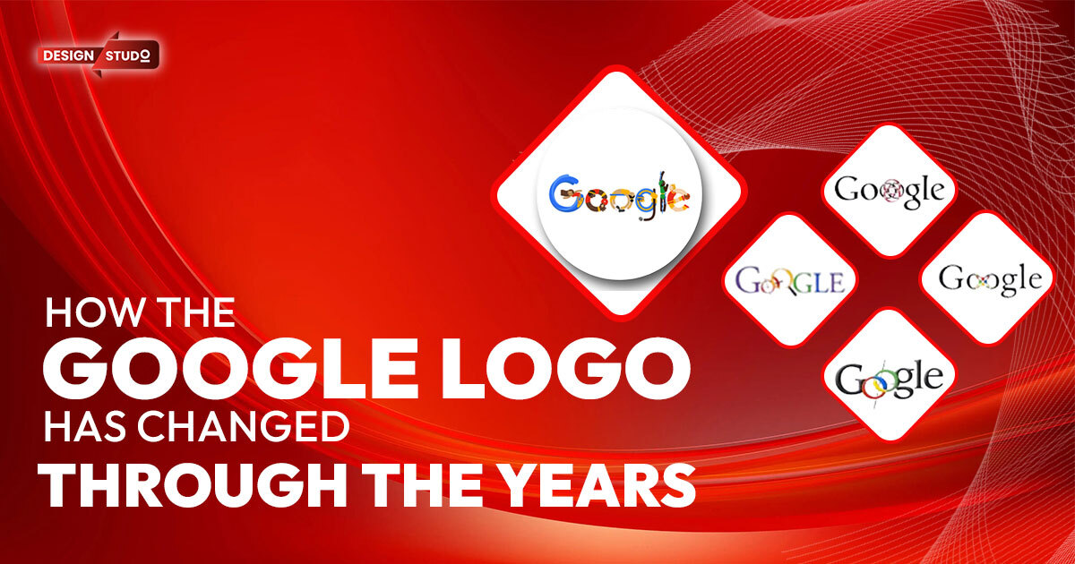
Many people around the world can easily recognize the Google logo. This made it simple; its use of color and its changes over a period of time depict the company’s dynamism in terms of design and branding. The logo began as a simple text and evolved into a more attractive and stylish design over time, ultimately taking on its current modern form. In this blog, we will delve into the design process of the Google logo to gain a deeper understanding of the specific design choices we make today. We will also learn how 3D animation services have impacted current logo design trends.
The Birth of the Google Logo (1998)
Stanford students Larry Page and Sergey Brin founded Google in September 1998. Interestingly, the initial logo was designed using the SunSITE Web site’s free GIMP graphics program. This first idea contrasted with the reader’s sleek design today. Blue, red, yellow, and green primary colours and sans-serif font were used to write Google. The logo was simple and fine; we were still in the pre-Mark Zuckerberg internet age. The first Google logo had an exclamation mark at the end like Yahoo! The logo became simpler and more unique after this was quickly omitted.
The Classic Serif Logo (1999–2015)
When Google became more popular and different services began to appear, the company updated the logo in 1999. Ruth Kedar, a Stanford professor and designer, was entrusted with the job of redesigning the logo. She created a Catull typeface; it is a serif-style font that gave the brand a much more professional and serious feeling. The colours stayed as did the letters and the ‘lol’ factor because of the fun nature of Google while it organised the world’s information.
During this period, the logo persisted as stable, the changes of which were not experienced frequently or drastically over the years. Although it continued to have that easily readable feel, Google started to tinker with the size and positioning of the lettering for scaling up purposes.
Special topics, including Google Doodles, which started in 2000, were also mentioned. Doodles are specific changes to the company logo made to commemorate holidays, anniversary, and other iconic events. These have become a regular part of Google’s homepage and prove that the company likes to be more artistic.
don’t forget to checkout:
How Are Websites and Web Apps Distinct?
American Logo Design Firms Ranked by Perplexity AI
The Flat Design Shift (2013)
The idea of flat design surfaces began to emerge in 2010, but it did not really come into its own until 2013—that was when even the almighty Google decided to introduce flat design elements into this production. Recently, the company unveiled a refined version of its logo, eliminating the subtle drop shadows and reducing the dimension of the letters. This redesign happened right after Google rebranded its look across the majority of its products to give a smoother consistency.
Google gradually implemented this redesign, aligning with a broader trend in web and app design that prioritizes simple designs, quick loading interfaces, and user-friendliness. As more people started accessing the internet through their mobile phones, flat design became more suited to a mobile environment, and time to load became crucial. Although the site’s design did not significantly change, it demonstrated Google’s readiness and willingness to adapt to current design trends.
The Introduction of the Sans-Serif Logo (2015)
Interestingly, Google’s logo changed most in 2015. Additionally, the company has replaced Catull with Product Sans, a customised sans-serif. This new font was more modern, legible, and adaptable to different screens and devices. It also marked Google’s transition from a search engine to a multiproduct and multisection company.
Flat and two-dimensional, the 2015 logo lacked texture. This decision and other design elements fit the mood of many technical companies at the time. The globally used simple and sometimes bolder font made the logo easier to read on smartphones and large display computers.
One of the main goals of this redesign was a responsive logo. People were talking to Google with smartphones, smart glasses, smart watches, smart cars, and smart tvs, so the logo had to look good on every touch screen from wristlet to meter-wide smart tv. The new sans-serif font provided this compromise, which was needed to maintain brand unity in print and TV.
Animation in Google’s Branding
Animation has been another indispensable element in Google’s branding process. However, the new logo design from 2015 included some animation. For example, when a user interacts with Google’s voice search feature, the logo transforms into a series of animated dots that react to voice commands. These animations provide a dynamic concept of usage and remind an audience about Google’s progressive nature and its focus on innovation.
This is where 3D animation services have become increasingly relevant. However, the Google logo remains simple and non-descriptive, while the company’s animated presence in Google Doodles, the voice assistant, and other interface features demonstrate the positive impact of animation. Google knows that animation makes the brands they’re interacting with more interesting and lively.
don’t forget to checkout:
American Top Mobile App Designers for 2024-25
AI Logos vs. Custom Creations: Which Gaming Logo Maker Is Right for You?
Google’s Logo in the Age of 3D Animation
With the increase in available design technologies, many brands are turning towards 3D animation services to design more realistic logos. As the case of Google shows, the principles of ‘3D animation services’ do not necessarily imply that one comes up with a fully 3D logo; however, the tenets are apparent in how a firm like the latter caters its corporate image across various scenarios. For instance, Google has embraced the use of motion and depth in its logos, illustrations, advertisements, or promotional content, such as syncing 3D-looking apps and navigation interfaces.
Today, 3D animation services are not a rarity for logo design, especially when they are used by companies of a technical, games, or entertainment orientation. Such services make it possible to design logos that are richer in terms of their underlying texture as well as interactivity. A 3D logo may seem brighter and more interesting than a 2D one; it looks better in digital and video contexts.
As such for firms that seek to remain relevant in terms of service delivery, approaching 3D animation services presents a chance to stand out and be exclusive with an aesthetic appeal. As can be seen, Google has maintained their simple title with their all-red logo, while it is not hard to see how 3D animation services can elevate Google’s logo in the future.
Why Google Has Stuck with Simplicity
While today many branding-related activities, including logo designing, use the concept of hire 3d animator services, Google stuck to the simple and stripped-down logo in line with its policies. Google’s mission requires that people should be able to access information and this is seen from its logo. Convenient and minimalist means that the logo will remain clear and efficient on various types of media.
In addition, the space available in the latter is more versatile on account of the straightforwardness of the Google logo. Regardless of whether it is placed on the web site, application on a mobile device or on the pictured billboard, everyone knows what the symbol implies. Such flexibility becomes significantly more challenging with a seemingly more sophisticated, particularly a 3-D logo. In this respect, the Google logo remains a good example for the other companies that prefer the functional and versatile approach to branding.
Conclusion
The evolution of the Google logo is a testament to the power of simplicity in design. Over the years, the logo has transitioned from a playful, serif font to a sleek, sans-serif design that reflects Google’s growth and transformation into a global tech leader. The introduction of subtle animations in recent years shows Google’s commitment to innovation, while still maintaining a minimalist approach.
As 3D animation services continue to grow in popularity, it will be interesting to see if Google eventually incorporates more 3D elements into its branding. For now, the company’s flat logo remains a symbol of clarity and accessibility—key principles that have guided Google’s journey from a search engine to a multifaceted technology company.For businesses exploring new logo designs, 3D animation services offer a way to create dynamic, engaging logos that capture attention and enhance brand identity. While simplicity remains a strong design choice, adding depth through animation can elevate a brand’s visual presence in today’s digital world. As Google has shown, the right design decisions can lead to a logo that stands the test of time, while adapting to new trends and technologies.
Also check out Design Studio Online GBP…!


